


Outpost Fiftyone are an up and coming design firm with a military aesthetic


Collatoral


front: the logo emblem is embossed back: the logo emblem is debossed

Logo: There is slight kerning between the letter spaces
of Y & O, in Outpost 51, to create a slight separation of the two words.
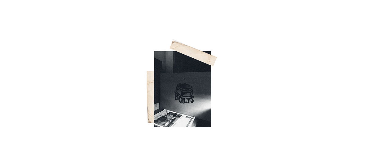
Photography: The photos are made to capture a rawness that other design firms will not always provide.
This is done by using photography that does not shy away from work in progress shots.
Coffee Cup: Vintage paper, with hand writing, has been used across the branding to give a raw aesthetic
Coffee Cup: Vintage paper, with hand writing, has been used across the branding to give a raw aesthetic
Textures: A combination of vintage paper and grained black and white photography creates a bold
and raw aesthetic, creating a strong military style.


